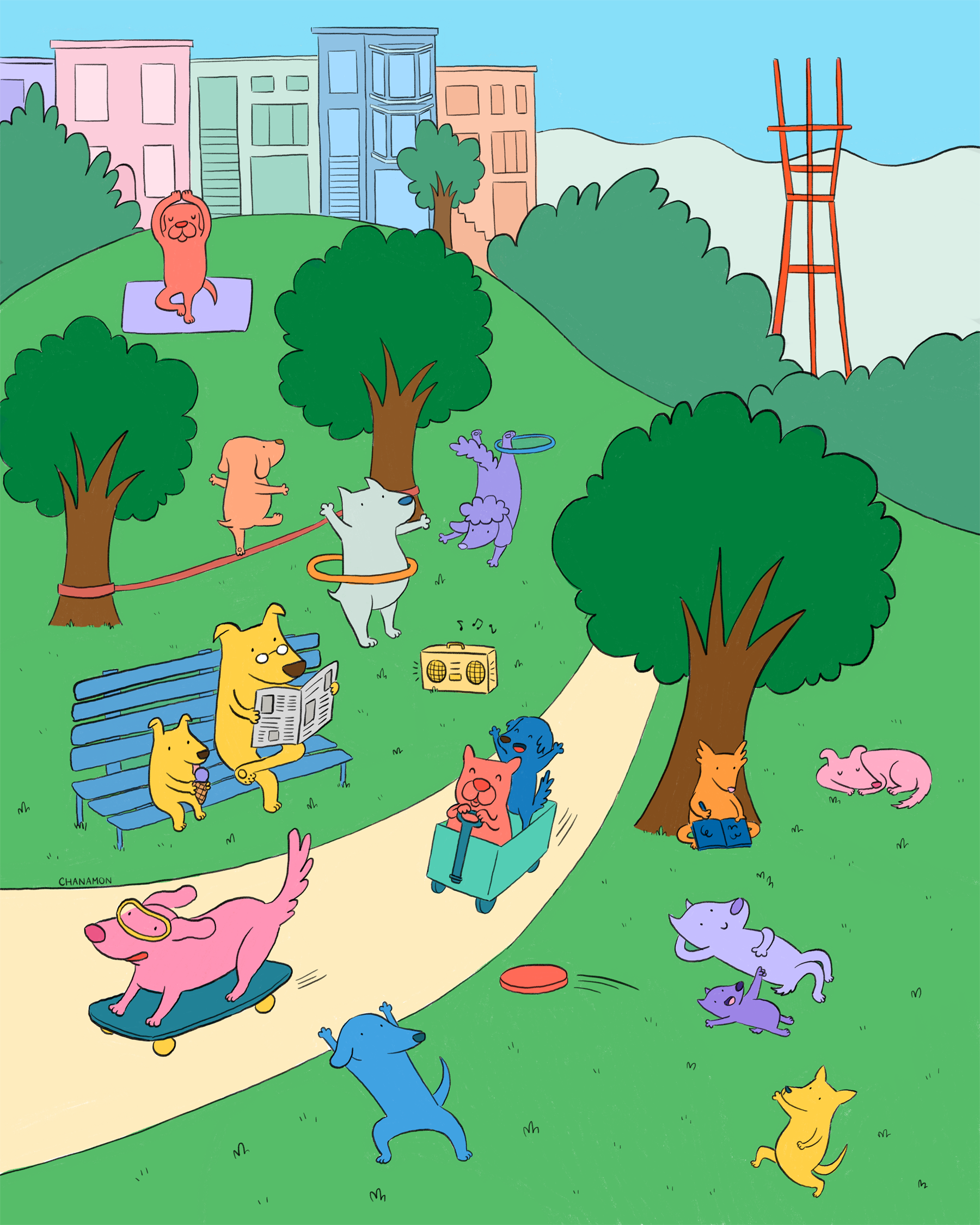
Dog Park Illustration Process
I have been wanting to create a scene full of characters for a while, but I always feel overwhelmed with the idea of drawing a landscape and filling it with creative ideas. I’m pretty insecure about my talents in both of those areas.
While doodling my morning pages one day, I was inspired by my trip to Dolores park the day before. I wanted to capture the “fun in the sun” vibes that always radiates from Dolores park on a busy day. Referencing a photo I took of the sunny hillside and Sutro tower in the background, I quickly sketched out a scene of the park.


One of the reasons I’ve been wanting to illustrate a full, busy scene is that I have been really wanting to design a puzzle. For me, a worthwhile puzzle has lots of little details to really catch your interest as you’re putting it together. I think the key to a challenging puzzle illustration is having a lot of detail as well as repeating elements or spaces to make where a piece goes pretty ambiguous. Which of these 10 pieces is the top of a cloud? Is this piece this person’s shoe or this person’s? These parameters also feel conducive to my illustration style, where I love to have tiny details but also broad flat colors that repeat throughout the illustration.
I initially sketched my Dolores park idea with just people a few months ago. I think the concept of drawing all these people when I’m continually changing how I want to draw them discouraged me from continuing the illustration further.

For my next sketch iteration, I realized a lot of my current love for Dolores park stems from the dogs there, so I incorporated people with their dogs at the park. After I drew a dog flying down the hill on a skateboard (something I’ve of course only seen humans do), an even better idea struck. My favorite time to go to the park is when there aren’t many people so my dog can run around. It’s extra fun when other dog owners are doing the same and the field is mostly dogs running around having the time of their lives. With a play on the name “dog park”, a park of only dogs doing things humans would do at the park was born.

After I had the good sketch down, I entered the fearful phase I often do for many illustrations, the coloring phase. At first I tried to use my usual color palette, but my typical green didn’t match what I had in my head for the bright and sunny grass. During this time, I visited SF Zine fest and ignited a deep interest with risograph printing. After pouring over all of Natalie Andrewson’s Patreon posts, I decided to try my hand at choosing colors in photoshop using various opacity layers and Multiply.

The final result looked much more like a stormy day in the park for my liking, so I took it back to the iPad to select colors straight from the color picker, using the photoshop version as a guide for hues. It felt a little plain to me, I think because my eyes gad been staring at risograph textures for a week. Looking at it a few days later with fresh eyes, I think it’s pretty good. Let me know what you think in the comments and if you’re interested in a puzzle version!

Leave a comment
This site is protected by hCaptcha and the hCaptcha Privacy Policy and Terms of Service apply.